With a new year comes new paint trends. This year the paint manufacturers tried to not only find what they felt was the color for this year but a color to start a new decade. They follow paint trends pretty carefully, after all, it is their business. They put a ton of research into sales trends and use those to develop yearly forecasts for what they believe will be the color or colors of the year.
While some of us aren’t exactly running to paint our entire home in their elected color of the year it is fun to take a look at where the trends are heading and see how they could be incorporated in our home’s design. If you are ready for a room refresh look no further than our Paint Services team, they’re paint experts who will get your home painted the way it should be!
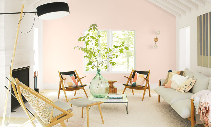
Benjamin Moore – First Light
Benjamin Moore’s color of the year is First Light 2102-70. It’s a soft, fresh pink. They describe it as a fresh palette. A revitalized spirit. A soft, rosy hue blooming with potential. It is the backdrop for a bright new decade.

“We selected First Light 2102-70 as our Color of the Year 2020 to represent a new dawn of idealism, design, and living,” said Andrea Magno, Benjamin Moore’s Director of Color Marketing and Development. “First Light 2102-70 reflects a new definition of the home—a shift in mindset from the material to satisfying the core needs in life: community, comfort, security, self-expression, authenticity and ultimately, optimism.”
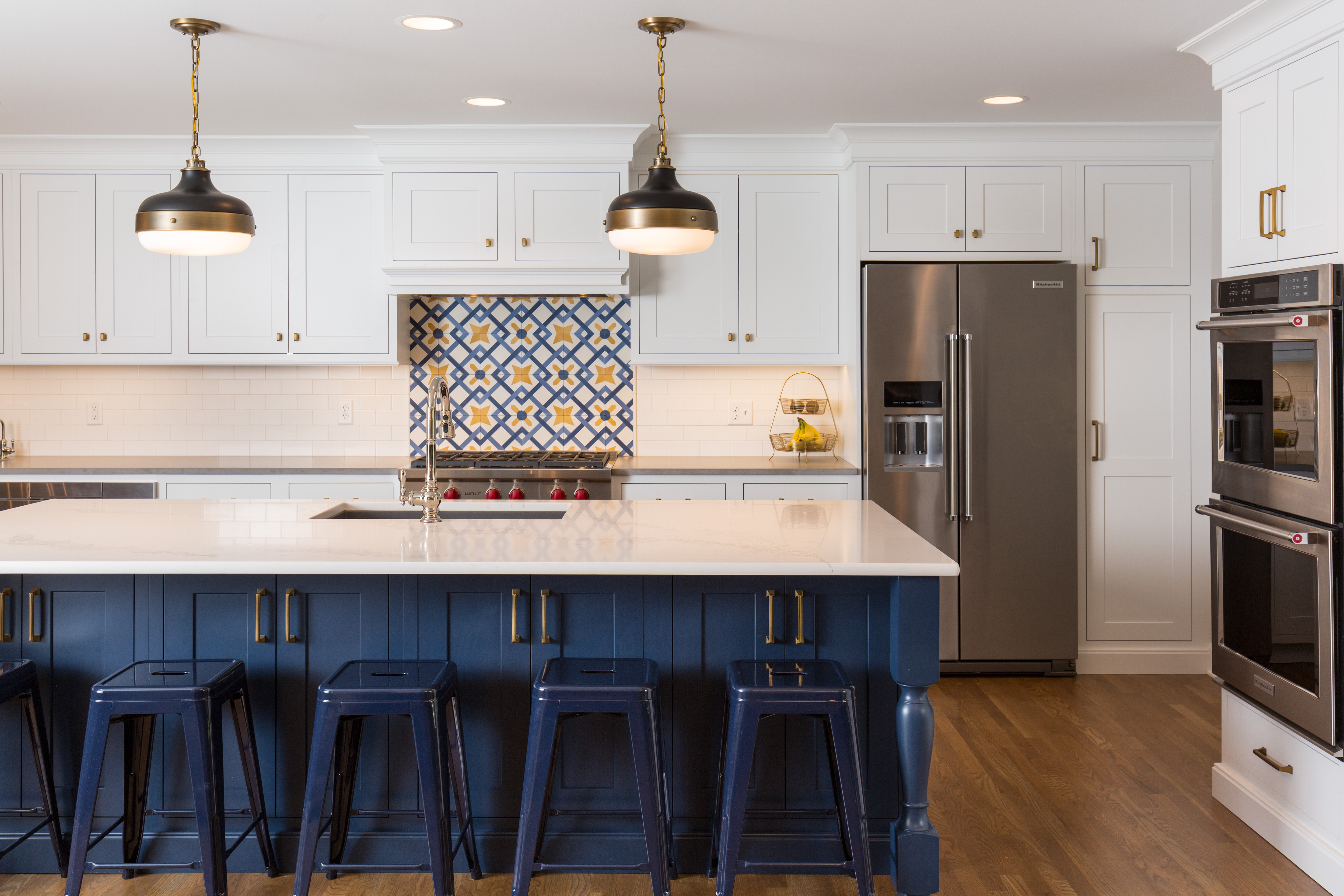
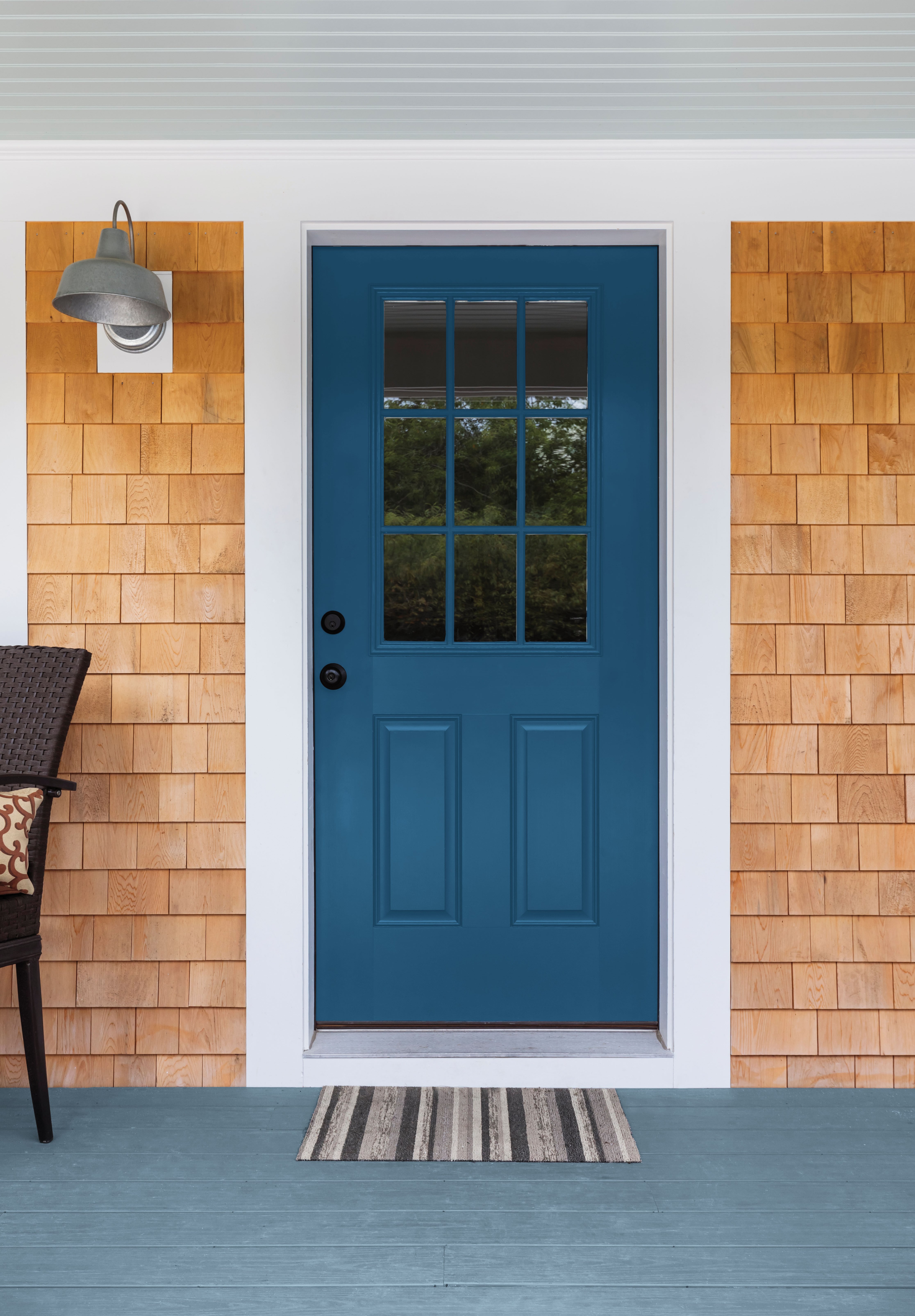
Sherwin Williams – Naval
Sherwin Williams selected a tried and true color; one we’ve used over and over again. Naval SW 6244, is a rich navy that creates a calm and grounding environment infused with quiet confidence. We love navy in design and have used it in doors, cabinets, wall color and of course accents. It’s become a sophisticated neutral.

“The use of color in interior design is changing. It’s not just about what a space looks like anymore, but how it makes you feel,” said Sue Wadden, director of color marketing at Sherwin-Williams. “People want to feel grounded and inspired to pursue their mental, physical and emotional well-being. Naval is reminiscent of the night sky, which people have looked to for centuries for guidance, as a muse, and as a reminder to live more mindfully.”
Here is one of our favorite projects which uses Sherwin Williams Naval for the island cabinetry.
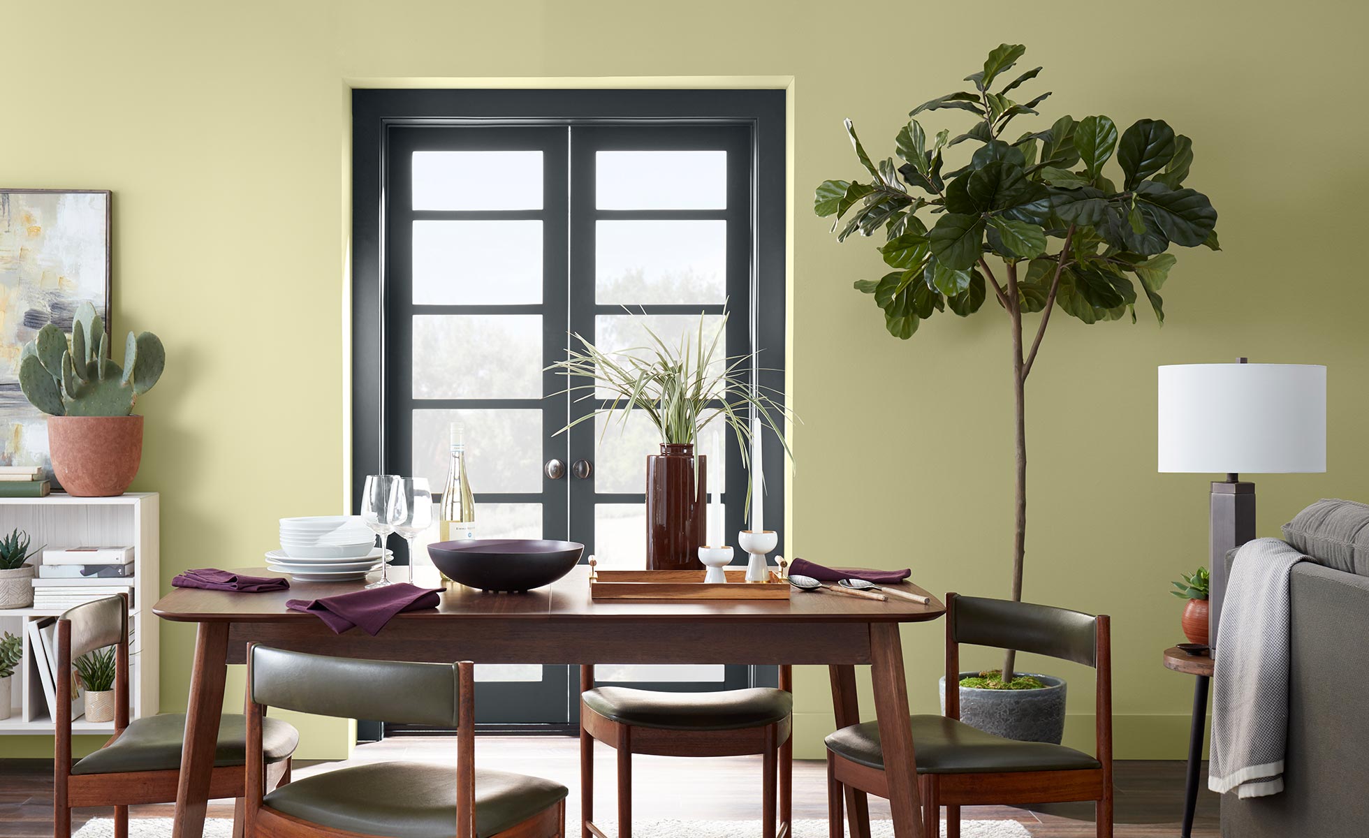
Behr – Back to Nature
Behr’s color of the year, Back to Nature S340-4, shows a return to earthy colors. As nature’s favorite color, Back to Nature is a restorative and revitalizing green hue that engages the senses and pairs well with other colors both inside and outside your home.
“Green is nature’s favorite color,” says Erika Woelfel, vice president of color and creative services at Behr, of the brand’s 2020 Color of the Year. “It’s kind of like nature’s neutral.”
PPG – Chinese Porcelain
PPG also selected a dark blue color as its color of the year. Chinese Porcelain’s PPG1160-6 blend of cobalt, moody ink blue offers escapism in today’s data-driven society. Chinese Porcelain is a rich and traditional hue that provides the perfect, agreeable backdrop for vivacious colors to pop.
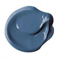
“The faster technology moves and the more convenience it offers, the more we seek activities, experiences, and lifestyles that impart slowness and realness into our lives,” said Dee Schlotter, senior color manager, PPG paint brand. “The need for simplicity and escapism from technology is, in part, the reason that consumers are craving blues like Chinese Porcelain that bring us closer to natural elements such as the sea and sky – creating serenity in any space.”
If you’re thinking about making a paint change give the paint experts on Schloegel’s Paint Services team a call. They’ll make your home feel like new again!