2016 is almost here, so we thought we could take a moment to look back at some of our favorite projects of the past year. Join us as we revisit the best of 2015.
From Drab to Fab! Kitchen Remodel
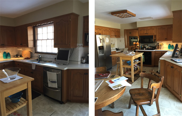
 When we first met our homeowners Brian and Jayne, they had been considering remodeling the kitchen in their 1960s home for about 5 years (ever since they had moved in). They had preliminary ideas from working with a previous designer, but became frustrated and postponed the project when the options they were presented with didn’t feel quite right. Now, looking back, they are happy they didn’t make any quick decisions they would regret because they have had time to really live in the space and reassess their true wants and needs for their “dream kitchen”.With the balance of their first floor renovated, the kitchen was definitely an eye sore. From the vinyl flooring and oak cabinets with an arched door
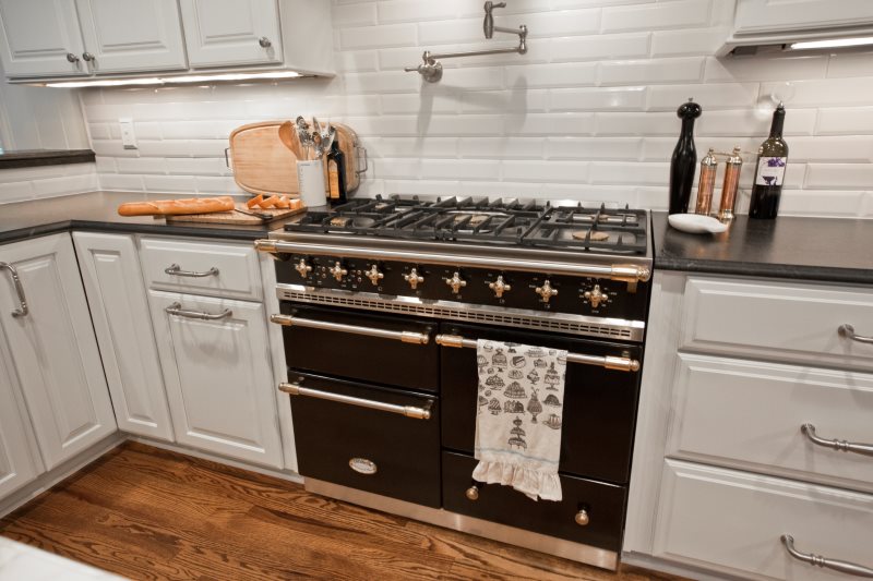
With the balance of their first floor renovated, the kitchen was definitely an eye sore. From the vinyl flooring and oak cabinets with an arched door style, to the boxed ceiling lights, there wasn’t a single item or design feature in the kitchen that the homeowners liked. One of the biggest changes they wanted to see was to have the wall between the kitchen and family room opened up to bring in more light and create a better entertaining space. From day one, they had their hearts set on a 42” black La Cornue gas range with brass and stainless accents and when Jayne came across a photo of what eventually became their kitchen island, a piece that also had the same metal accents as the range, we had our inspiration pieces that the rest of the kitchen would be designed around. The homeowners needed more storage and better lighting. They also wanted to incorporate French doors to the backyard, marble accents, and decorative elliptical mullion door cabinets. We knew this transformation was going to be awesome but we had our work cut out for us to get there!
Once we started truly planning and designing this space, we went through several floor plan and elevation renditions before settling on what ultimately became the plans for their “dream kitchen.” After removing the bookshelves and wall separating the family room from the kitchen, we closed in the existing exterior door to the back yard to create room for a raised seating area at the counter. We also removed the window at the kitchen sink to design a long run of cabinetry and counter space and create the perfect location for the new range.
We were even able to add a few more feet of cabinetry and countertop around the range by framing a hidden message center across from the door to the garage to create a nook for a charging station, intercom system and every day papers that used to clutter the kitchen countertops. We then removed the bump out at the existing windows overlooking the back yard, brought the wall forward to be in line with the back of the house and framed for new French doors to the back yard. The homeowners feared removing the window above the sink and existing door to the backyard in the family room would make the space too dark, so we decided to add a decorative window at the existing back door location to let in more light and become a focal point since it is visible from the front door.
The final area left to design was the refrigerator wall, where the homeowners initially wanted all full height cabinets, but once we started placing appliances, we needed space for a coffee station and microwave. We installed the microwave at counter height in a large pantry next to an opening for a coffee station that had a wine refrigerator below where the coffee station function could easily be changed to a drink serving station for entertaining. We then incorporated the refrigerator and another pantry along the wall to capture ample storage space that was lacking in the existing kitchen.

With a layout to accommodate all of the homeowner’s wants and needs, moving onto the finishes was where the excitement really stared to build. With a 1920s era glamorous style through the rest of the house, we wanted to make sure the kitchen blended right in. With the dark ceiling and wall color, we knew lighting would play a major role in the functionality of this kitchen so it wouldn’t become too cave -like. Can lights were added throughout the kitchen, under cabinet lights at the perimeter work areas and decorative fixtures at the island and table.
White cabinets in the main kitchen with paneled appliances left the range to become more of a piece of artwork and also created a stark contrast from the blue on the walls and ceiling and helped lighten the space. The range hood also provides great light for cooking as well as a lower setting option to highlight the range when the kitchen isn’t in use. We carried the black from the range to the seating area where we installed a black decorative cabinet with elliptical mullions and glass fronts . The new set of French doors to the backyard were also finished in black. We replaced the existing door to the garage with a fire rated door to eliminate drafts and bring it up to code. The elliptical design from the decorative cabinet was re-created at the new window (in place of the existing back door) and a curved countertop at the raised seating area was used to soften the transition from the kitchen to the family room.
We used beveled, elongated subway tile instead of the standard 3×6 and honed black granite in lieu of gloss to keep timeless aspects in the kitchen but with a unique look and feel. The open island with wood shelves, and glossy marble countertop crates a beautiful statement while not blocking the range from view. We carried wood floors through the kitchen to tie into the rest of the first floor and create a seamless transition between the rooms.
As smoothly as everything seemed to come together, we were constantly fighting budget because a lot of the glamorous accents and design items came with a large price tags. We used two cabinet lines in order to create the black elliptical mullion door cabinet within budget and also had to forgo Calacatta Gold marble slabs on the countertops and up the backsplash that were too pricy and introduce the marble at the island top and use more practical honed granite for the kitchen perimeter. Even with a few design concessions, we were still able to add a pot filler, wine refrigerator, interior roll outs and ample drawers for maximum storage. The oversized cabinet hardware was the icing on the cake to all of the design features throughout the kitchen.
Once the project was planned to start, we prepared and presented a schedule at our preconstruction meeting. We also met on site with the homeowners, our production manager and lead carpenter at a weekly meeting throughout the project to make sure we stayed on track and all parties were on the same page throughout construction.
Corresponding through emails during the week on items such as change orders and the schedule made sure there weren’t any surprises during the weekly meetings. Of course nothing ever goes as smoothly as planned and when we opened the wall between the family room and kitchen, there was a plumbing stack running right down the center of the wall where the new sink is located. We re-routed the stack, but due to the fall required, the stack could not be completely concealed at ceiling height.
After re-routing the stack, we were able to incorporate the stack into a cased opening that’s height matched a soffit detail in the family room. The homeowners opted to paint the wood paneling and trim in the adjoining family room to match the white of the cabinetry that created a seamless transition.
[nested_row]
[nested_column span=”6″]

Click to see the Before Floor Plan
[/nested_column]
[nested_column span=”6″]

Click to see the After floor Plan
[/nested_column]
[/nested_row]
[code-snippet name=”disable-blog-feature-image”]